Terra Dotta AlertTraveler
Prototyping a new feature to increase engagement on the app, AlertTraveler
Timeline
September 2020 - April 2021
Skills
User research, interviews, surveys, heuristic evaluation, low-fidelity, mid-fidelity, and high-fidelity prototypes, writing formal report
Tools
Figma, Miro, Mural, Google Sheets, Zoom
Team
Anna Gilhool (myself), Kira Mintzer, Jason Fender
Terra Dotta Background
Terra Dotta is a software company that facilitates educational institutions' and business application processes and operations for international travel experiences. This project focuses specifically on the Terra Dotta AlertTraveler application, which has two main functions: educational institution to student communication and non-study abroad travel, such as conference, sports team travel, and independent research travel. The AlertTraveler app is designed to make safety and security simpler for the traveler. On the app, travelers get access to information about the host country, real-time alerts, and the ability to do self-check-ins to let others know where they are. Currently, the app is mainly used by travelers during emergency situations.
Problem Statement
AlertTraveler lacks an interactive experience for users and only fosters student to administration communication
Project Goal
Increase engagement on the application and introduce new non-crisis-related features that will increase users’ frequency of engagement
Research
Research Questions
What design features need to be improved to follow best practice usability standards?
What non-crisis information do student travelers value while abroad?
What information do students want to search for while traveling?
Research Methods
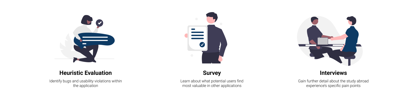
Research Findings
Heuristic Evaluation Findings
Unclear navigational elements
Navigation terminology does not reflect the page’s content
Lack of guidance telling user possible next steps
Survey Findings
Student travelers highly value being informed about safety issues
Friends/social networks, phone service, and research before traveling make students feel safer
83 of 87 student travelers (93.1%) like receiving travel tips from their friends
Common frustrations include not being able to access an app offline, heavy data usage, and inaccurate information
Interview Findings
The most frequent pain points experienced while studying abroad fell into the following categories: logistics, mapping/transit, and researching in advance
Six students (86%) said discussed how insufficient research limited their experiences abroad and researching in advance could have increased their feeling of safety
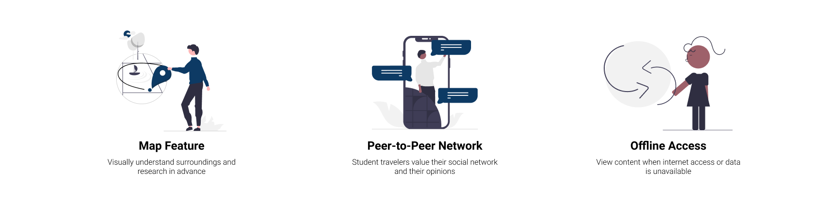
UX Requirements
Design Process
Brainstorming

Individual brainstorm of feature ideas that captured our UX requirements.
Wireframes
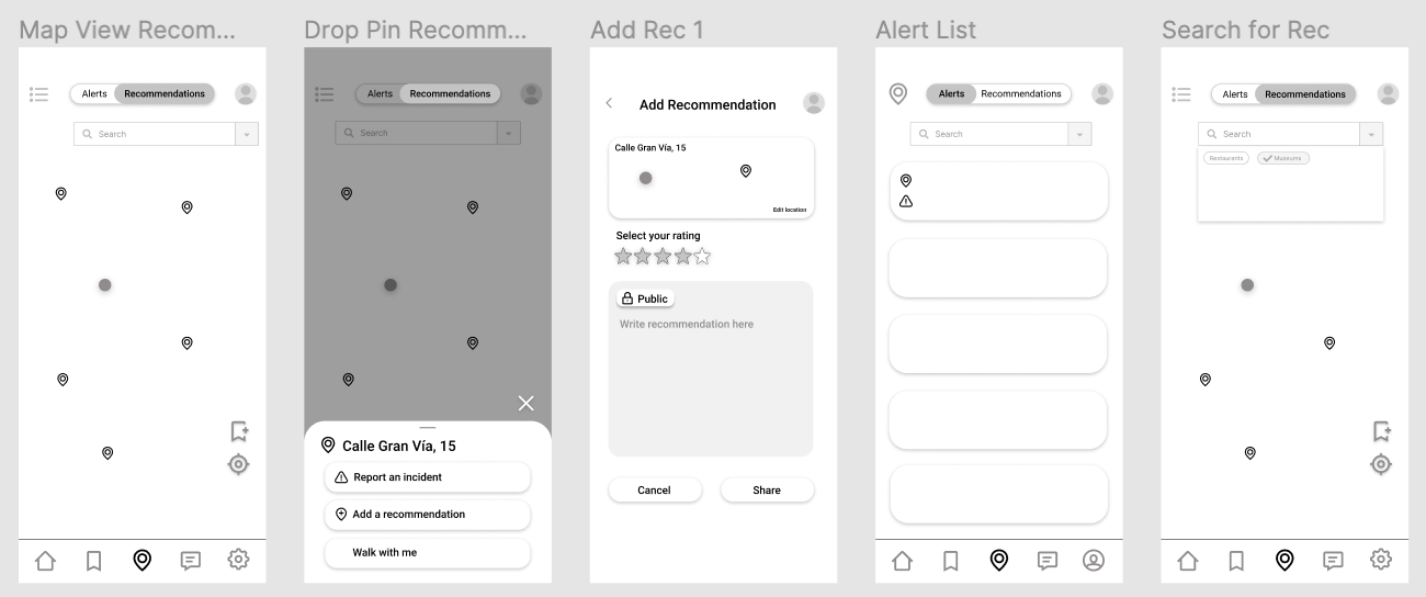
Wireframes built in Figma.
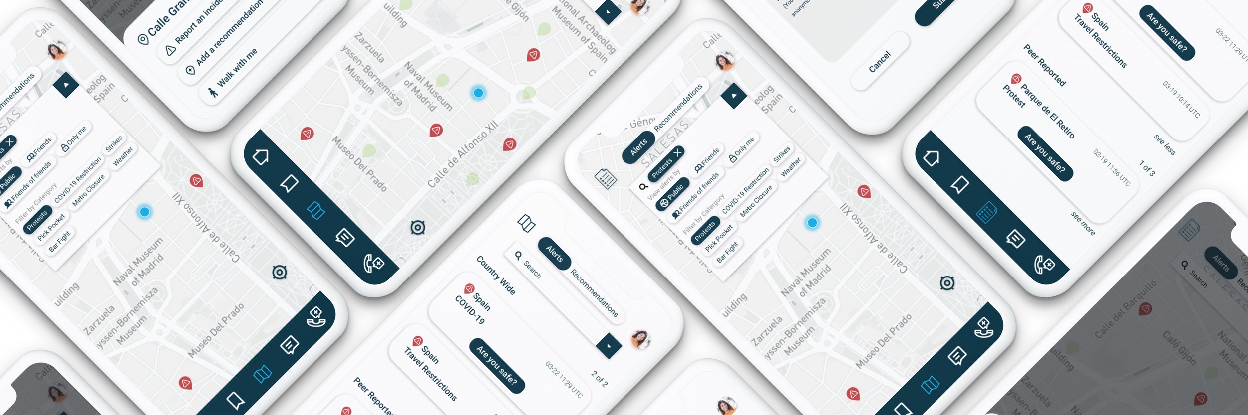
Mid-fi Prototypes
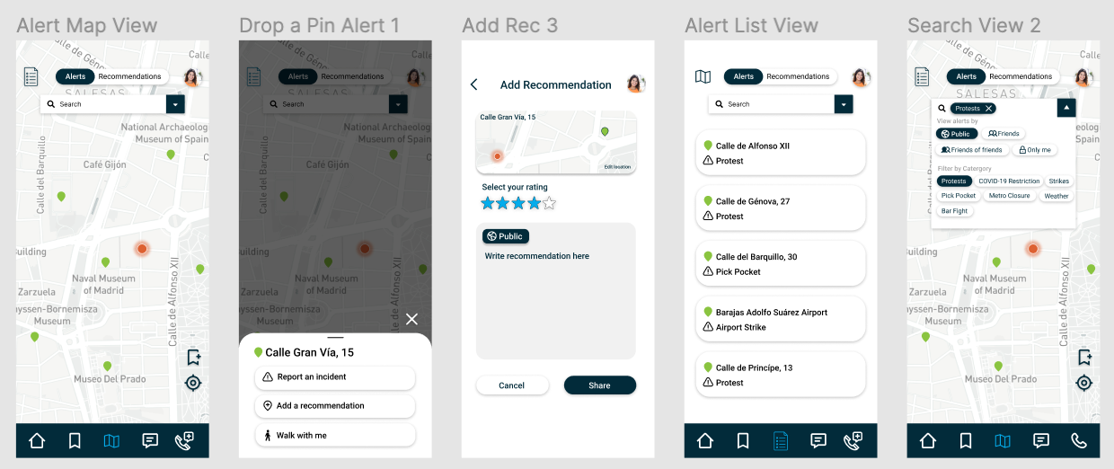
Mid-fidelity prototypes built in Figma.
Usability Testing
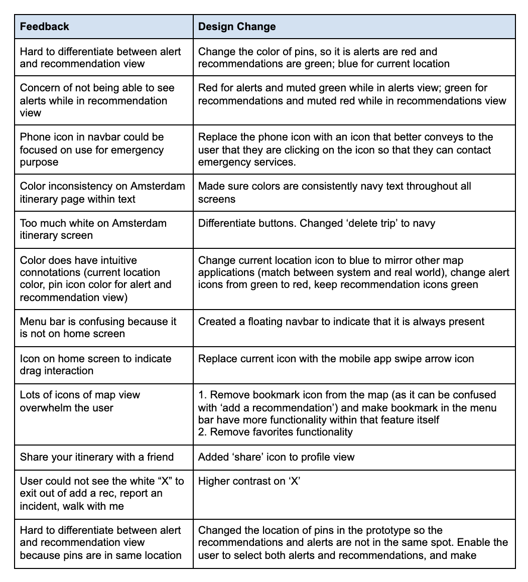
Our team gained feedback on our mid-fidelity prototypes through peer, instructor, and University of Michigan student travelers. We asked University of Michigan students a series of five tasks: search for protest alerts in Madrid, view the recommendation for the Museo del Prado in Madrid, add a Madrid recommendation to the map, find out what the official languages of Madrid are, and view your trip itinerary to Amsterdam. After getting feedback, we iterated over our mid-fidelity prototypes. The feedback and changes are defined in the table below: